
Analyzing various studies on the trends of mobile devices, we observe that the use of these devices is increasing. In fact, mobile devices lead the world’s ranking with 88% of mobile users. And not only in utilizing mobile phones, many people who have and use the mobile, but it is also the most used device to access the Internet: about 95% of people access the Internet through their mobile.
In addition, the use of mobile applications has grown more than 100% in the last 3 years. Users have an average of 17.8 applications installed on their smartphones and 64% say they prefer to buy through the App, compared to 52% who prefer to make their purchase through the seller’s website.
All these data show us the importance of designing Apps for mobile devices that are intuitive, attractive, and in which navigation is as simple as possible. When working for designing or mobile app development, the main problem we face is the small space we have, due to the small size of mobile screens.
Therefore, we have to make use of different resources that allow us to show all the desired content and make it easily accessible, but without overwhelming the user. Today we show you some of these resources.
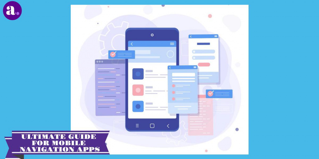
Table of Contents
Drawer Navigation
The drawer is a navigation panel that shifts from the left edge of the mobile displays to the main navigation options of the app. The user can carry the navigation drawer on the screen by sliding from the left edge of the screen or by touching the application icon in the action bar.
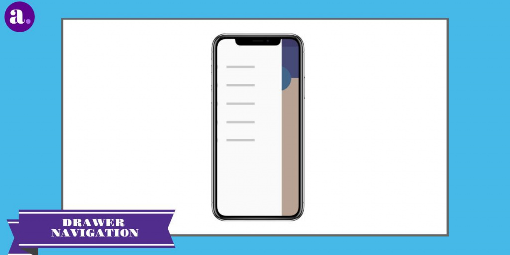
As the navigation drawer expands, the content is covered, but not the action bar. When the drawer is fully extended, the action bar adjusts to its content by replacing the title of the current action bar with the name of the application and eliminating all actions that are contextually visible under the drawer of the navigation.
The overflow menu with the standard action items for adjustments and help remains visible. Because they are transient, navigation drawers make visits clearer. It can also be used at deeper levels in the navigation hierarchy. Allowing users to switch to the most important screens of their application from anywhere in the application.
Keep the contents of the navigation drawer focused on the navigation application. Expose the navigation centers of your application as list items inside the navigation drawer – one item per row.
List Navigation
This navigation is based on the opposite approach – it takes up all the space and uses the main page of the application only for navigation. And as you move, users open other menu items. This template works well for describing tasks in the form of a list.
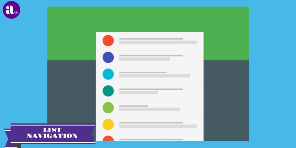
Especially when users use only one branch of the navigation hierarchy per session. Moving users from overview pages to more detailed ones helps them find the content they need and focus on its content in a separate section.
List navigation is the simplest and most consistent. You can operate with large pieces of information and disclose them without overloading the user. As soon as the user decides which block to choose, he can be shown all the necessary content.
Tabbed Navigation
This navigation is a design legacy for computers. Typically, a panel has a relatively small number of buttons that are equally important and require direct access from anywhere in the application. Tabs do not hide navigation and give direct access to the necessary section.
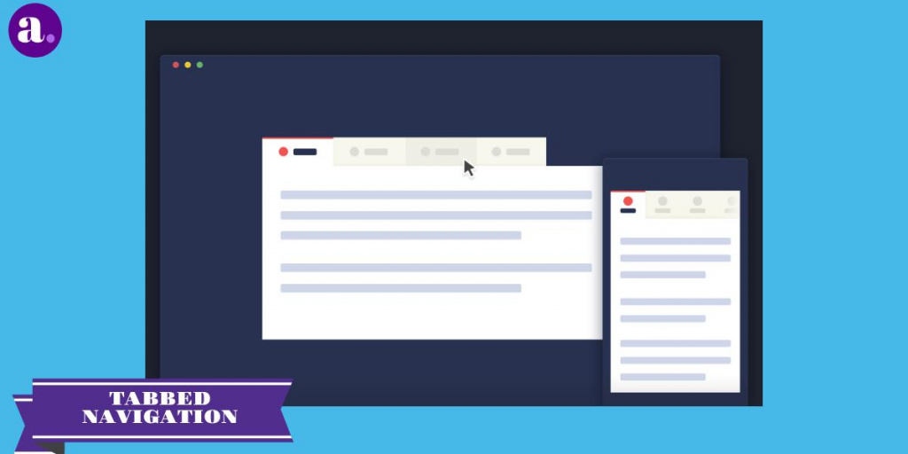
Tabbed navigation is a great solution for applications with a relatively small number of priority navigation options – up to five. The panel provides access to the main functions with a single click, and the user can quickly switch between them.
The tab bar is stable, and navigation remains in sight regardless of which page the user is viewing. He clearly sees all the main functions of the application and has access to them with one click.
Users expect to see a specific order in the tab navigation. The first element should be the main screen of the application, and the next ones, depending on their priority or logic in the mind of the user.
Grid Navigation
The grid navigation is accompanied by the grouping of tabs. Dragging one tab over another will be grouped, so we can have a greater organization on all open tabs since sometimes you can experience a lack of control if we have many open tabs.
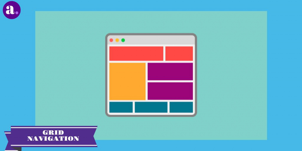
When opening a new tab in your mobile application, you have the option of creating a new tab in the group, opening two tabs with the app at the same time. A grouped tab shows another grid view with all the tabs it includes. This is a very organized way of creating multiple navigation options while providing a detailed grid view of your mobile app’s pages.
Swipe Navigation
After the appearance of touch screens, control using gestures – swipe, rotation, or scaling immediately became popular among designers. Today, the success of a mobile application largely depends on how convenient it is to control it with gestures, especially through a swipe.
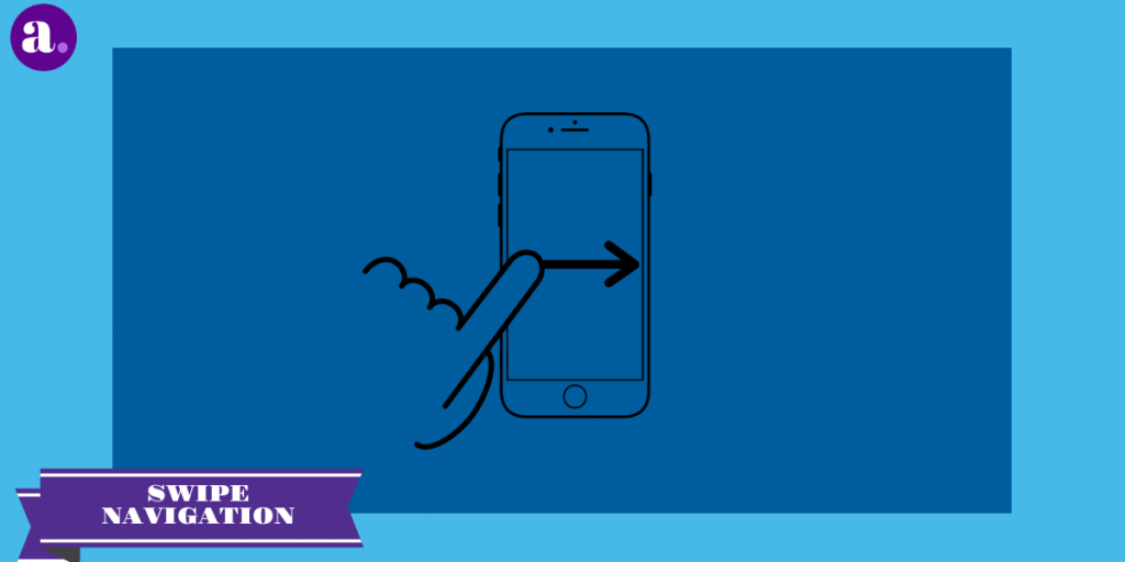
This navigation is good when users want to learn the details of specific content. In this case, they will focus specifically on the contents of the application, and not on navigation.
Make sure you don’t need to teach people a completely new way to interact with the interface. Create a familiar experience. For example, if you are developing an email application, you can use the “swipe” action, because this gesture is familiar to many users.
Teach people to interact with your interface. Avoid long monotonous tutorials. Instead, show only information related to the user’s current activity. Implement the swipe navigation into your mobile applications in a way that is most familiar and easy for its users.
Conclusion
These are some of the resources we can find when navigating with mobile devices. At this point, the important thing is that we are clear about what we want to tell our users and ensure simple and intuitive navigation. If the experience of our users is positive, we will achieve better business objectives.
Related readings
- Free AI App Builder vs Paid No-Code in 2026: What Small Teams Learn Too Late
- Best No-Code App Builder for Small Business in 2026: What to Choose After AI Hype
- AI App Builder 2026: Which Platform Is Best for Launching Fast Without Coding?
- Adalo vs Glide vs Thunkable in 2026: Which No-Code App Builder Fits Your Business?
- Best AI App Builder in 2026: Free vs Paid, Real Costs, and What to Choose